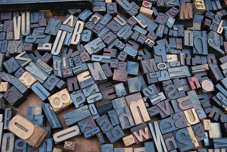
Typography isn’t just about selecting a typeface or deciding on a font size. It’s a meticulous art that bridges the gap between mere text and impactful communication. Every website you admire for its readability and aesthetics owes its charm to a deep understanding of typography.
The Evolution of Typography in Web Design
- The Primitive Web: Back in the '90s, web-safe fonts like Comic Sans, Verdana, and Georgia were all the rage. A limited palette meant limited expression.
- Web Fonts Revolution: Introduction of CSS3 allowed designers to break free from constraints, embedding custom fonts, thus personalizing the web.
- The Age of Responsive Typography: As smartphones and tablets proliferated, the need for fonts to adapt and remain legible across devices became paramount.
The Art & Science Behind Font Scales
While choosing fonts is subjective, scales ensure objectivity:
- Golden Ratio: Inspired by nature, art, and architecture, this ratio (approximately 1.618) creates a visually appealing progression.
- Major Second: It offers a gentler progression at a ratio of 1.125, allowing for subtler visual differentiation.
- Perfect Fourth: With a bold ratio of 1.333, it’s great for dramatic contrasts.
Scaling Tools: Beyond ModularScale and Type-Scale, Gridlover offers a mix of typography and grid.
Legendary Foundries & Typographers
- Monotype & Eric Gill: Monotype, established in the late 19th century, collaborated with Eric Gill, who created Gill Sans, a typeface that has been influential in design and typography.
- Hoefler & Co & Jonathan Hoefler: The foundry behind typefaces like Gotham, used notably in Obama's 2008 presidential campaign. Jonathan Hoefler's work merges historical and contemporary influences.
- Adrian Frutiger: Renowned for typefaces like Univers and Frutiger. His designs have been instrumental in airport signage systems due to their high legibility.
- Paula Scher: Not just a typographer, but a design maestro. Scher's typographic artwork for The Public Theater is iconic and has defined a generation of design.
Best Practices for Engaging Typography
- Hierarchy & Flow: Define text roles. Bold headers, distinguishable subheadings, and a readable body text make scanning content effortless.
- Mobile Typography: As screens shrink, your typography should remain legible and appealing. Think larger fonts, shorter line lengths, and ample spacing.
- Kerning and Leading: Ensure even spacing between letters and lines. A tight or loose layout can distort readability.
- Web Performance: Using a service like Fontface Ninja can help identify and optimize web fonts.
Venturing into Premium Fonts
- MyFonts & WhatTheFont: MyFonts boasts a huge library and its “WhatTheFont” feature can identify fonts from any image, assisting designers in matching fonts.
- FontShop: Established in the late '80s, it offers classics and innovative designs.
- Testing Before Investing: Fontstand introduces a unique model where designers can test fonts in projects without immediate purchase.
Ensuring Accessibility
- High Contrast: Tools like Colorable can test text-background contrast.
- Avoiding Over-decoration: Decorative fonts might look enticing but can harm readability. Save them for headers or special mentions.
- Embrace Resizable Text: Using relative units in CSS (like ems and rems) ensures that text can be resized by users without disrupting the design.
The Art of Font Pairing
Font pairing involves combining different typefaces in a way that they complement one another, creating a balanced hierarchy and enhancing readability. Here are some tips and considerations:
- Contrast, Not Conflict: Pair fonts that offer distinct contrasts — for instance, combine a serif font with a sans-serif. But ensure they don't clash in terms of mood or style.
- Stick to a Theme: Fonts convey emotions. A modern sans-serif might not pair well with a decorative script that's evocative of the Victorian era.
- Limit Your Choices: As a general rule, it's wise to stick to just two fonts on a webpage to avoid visual confusion. If you need variety, consider using different weights of the same font.
- Hierarchy Matters: Usually, a bold or distinctive font works well for headers, while a simpler, highly legible font is best for body text.
- Trust the Classics, but Don’t Fear Experimentation: While there are tried-and-tested font pairs that designers swear by, don’t shy away from experimenting and finding your unique combinations.
Font Pairing Tools: If you’re unsure where to start, tools like FontPair can suggest and showcase combinations that work well together.
Winning Web Font Pairs & Brands That Use Them
- Roboto & Roboto Slab:
- Google's Material Design: Google's design language utilizes Roboto extensively. While not a direct pairing with Roboto Slab, the combination illustrates how versatile Roboto is when paired with a contrasting font.
- Playfair Display & Source Sans Pro:
- Vogue: Playfair Display is reminiscent of high-contrast, stylish typefaces. While Vogue’s exact pairing differs, the magazine's digital presence evokes a similar feel, with stylish headers complemented by legible body text.
- Montserrat & Merriweather:
- Dropbox: In their branding and blogs, Dropbox has previously leveraged the clean, modern appeal of Montserrat in combination with readable, classic text fonts, embodying a balance similar to the Montserrat-Merriweather pairing.
- Raleway & Lato:
- Airbnb: While Airbnb predominantly uses their custom font 'Air', the feel and structure are closely aligned with Raleway, especially in the earlier days. Lato-like fonts were often used in the supportive text, creating a welcoming, modern vibe.
- Oswald & Open Sans:
- Upwork: The platform for freelancers has, in the past, opted for tall, bold headers akin to Oswald, combined with simple, clear body text reminiscent of Open Sans, reflecting a professional yet accessible brand image.
Typography isn't merely a design facet; it's the backbone of web aesthetics, functionality, and user experience. To master web design is to master typography.


